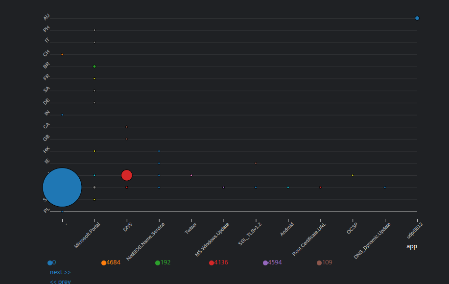
A bubble chart is a chart in which the data points are displayed as bubbles, and an additional dimension of the data is represented in the size of the bubbles. You will require three values to create a default bubble chart and four values to create a stacked bubble chart.
Creating a Bubble Chart
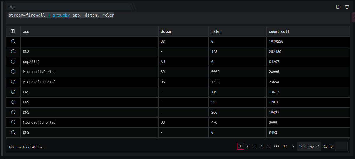
- Go to workbooks, add a DQL block and enter a query. Ensure the output of stream is grouped as per requirement.
For Example:
stream=firewall | groupby app, dstcn, rxlen
- The stream=firewall directive retrieves all fields for each event where Stream is FIREWALL. The result set is grouped by unique values of app , dstcn, and rxlen along with a count for each group. The result set is sorted in the descending order of count (by default). The output is displayed as follows.
- Now add a visual block, and enter the following details in the field provided.
|
Field |
Description |
|
Name |
Enter a name for this particular widget/chart that you are creating |
|
Type |
Select Bubble chart from the drop down |
|
Primary |
Select the primary value for the chart to be created |
|
Secondary |
Selected the secondary value for the chart to be created. Note: You can add multiple secondary values as per requirement. |
|
Type of chart |
Select the type of chart to be displayed such as: Stacked: In stacked bubble chart, the bubbles will be partitioned into different colors based on the field values. |
Default Bubble Chart
Stacked Bubble Chart